
Villa New Water by Waterstudio.NL
By Contemporist
March.9.2015
Photo Credits by Waterstudio.NL
Koen Olthuis of Waterstudio.NL has designed Villa New Water, a waterfront home for a family in Westland, The Netherlands.
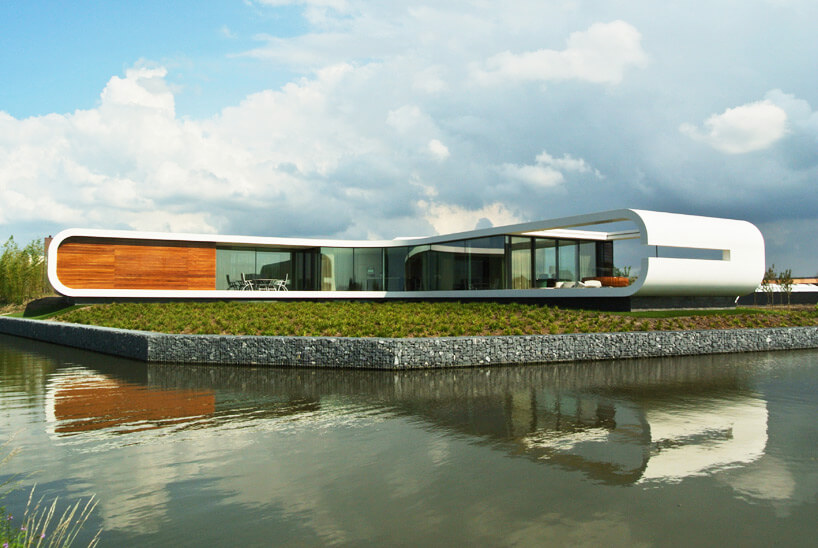
The description from Waterstudio.NL
From the very first moment of seeing the location for this villa, Koen Olthuis, architect and founder of Waterstudio.NL, set out to design a subtle villa that would complement its surroundings and enhance the experience of its surroundings.
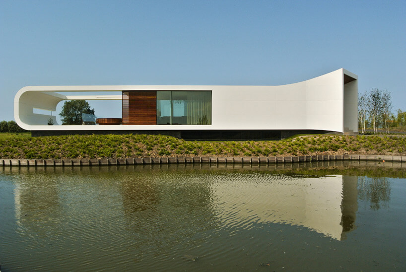
In order to maintain the rural character of the location, in the project the New Water, the assignment came with strict regulations which limited the volume allowed above the ground level. These limitations eventually proved to give rise to a rather sophisticated design filled with spatial solutions.
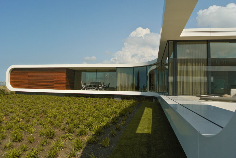
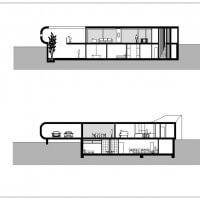
With the volume being limited, Waterstudio decided to make a floor under the ground level, providing extra surface within the limited dimensions of the building envelope. Solutions for allowing daylight into the lower floor turned out to be major architectural highlights.
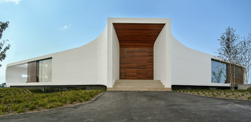
The volume was taken up as a white frame outlining large surfaces of glass making the whole villa rather transparent. Touches of wood here and there add subtlety and warmth to the overall scheme. The white frame, curling along the façade, closes off both ends of the house by framing different views of the outside. In the center, the same frame rises to mark the entrance. The entrance is designed to be a space to take in the morning sun. The façade alternates between materials like Corian and glass. A flawless material like Corian helps in realizing the strong and seamless building form as envisioned by the architect while glass helps by imparting transparency to the façade.
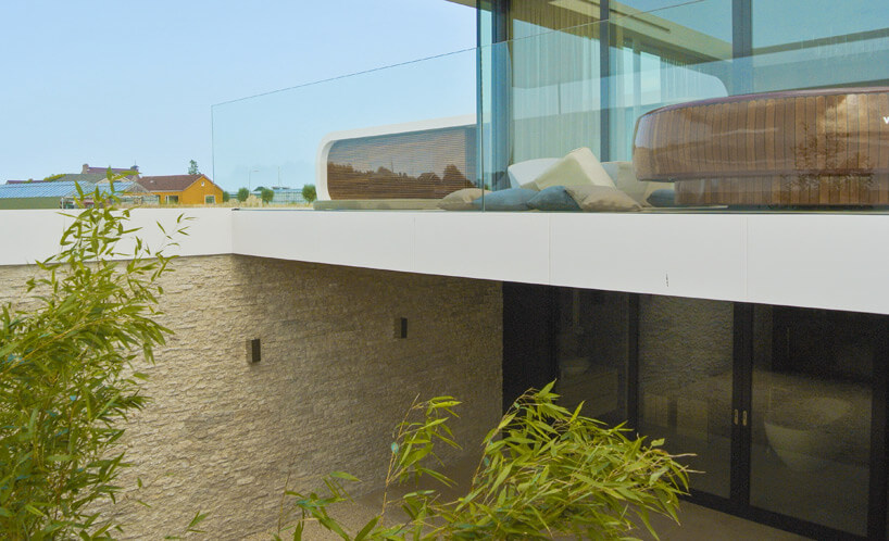
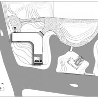
Besides the physical form of the villa, Koen Olthuis also designed its interior and garden. This brings together the different aspects of the design to harmonize with each other. At the site of the villa, one is welcomed by a few hills. These hills help in scripting the perfect approach for the house. As one approaches the hill, the house which is tucked away behind the hills, slowly comes into full view. The hill also serves as a natural route for the cars arriving at the house. On the other side of the water, a boathouse and a bar take shelter underneath the hill. A good view of the house can be enjoyed from the bar.
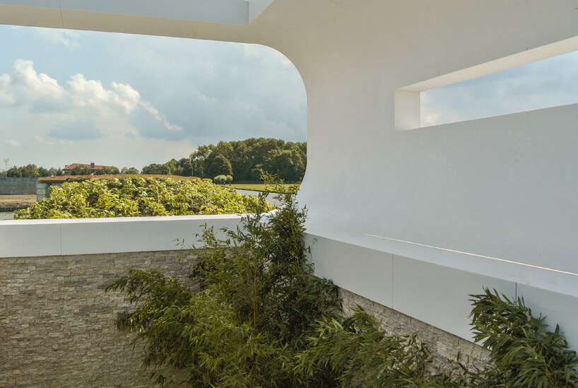
By keeping the garden green and simple, and bringing the outside water into it, the garden seamlessly blends with its surroundings. This seamless blend makes the entire area appear like one large garden from the house. To blend the green further with the house, an artificial strip of grass was used at the edge of the house. This would merge with the garden to give an appearance of the house floating over a green garden.
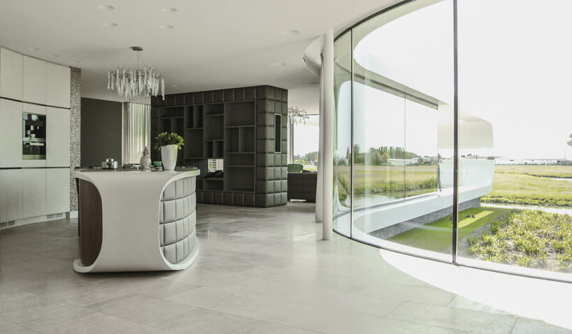
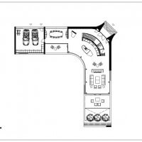
For the building, the guiding concept for design was transparency. Transparency was maintained throughout the house by creating an open layout where almost no doors were used. From the main entrance, one steps into an open hallway and is guided to the left or right by the round edges of the house. The ground floor contains a living room, kitchen and a dining room. The kitchen, located at the centre of plan in the ground floor, is surely the eye-catching design of the house. The long glass walls on the ground floor merges the outside and inside imparting a transparent feeling to the building.
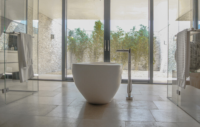
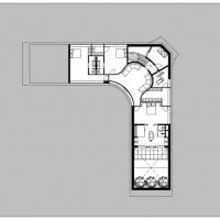
The underground level contains the private functions for the family like a master bedroom, kids’ bedrooms, the wellness area and the lounge. The master bedroom with an open floor plan connects to a hidden inner garden at one end of the building. The inner garden with gravel and bamboo trees can be experienced across the wellness area from the bedroom. The lounge is situated at the centre of the underground level and becomes part of the circulation area. Though this level is completely underground and covered from outside, one does not feel so from the inside.
The furniture in the house was also designed by Koen Olthuis. Using round corners and soft materials, the furniture is in contrast to the hard Corian used elsewhere. A good example of this is the cupboard with a fireplace that divides the living area and the kitchen. Another piece of furniture is the 10-person oval shaped dining table which is closed at the ends thus not allowing people to sit at the head of the table.
In this way, the concepts of transparency and seamless flow have been translated across the different scales of landscape, architecture and interior design.
Architect: Koen Olthuis – Waterstudio.NL
Contractor: Van Leent Bouwbedrijf
Lighting: Stout Lighting
Cladding: Corian DuPont